Showing posts with label Bad Cover Version. Show all posts

Thursday, October 28, 2010

When Bad DVD (and Blu-Ray) Covers Happen to Good Films: The Fred Dekker Edition

Poor Fred Dekker. In 1986 and 1987 he crafted two films that paid homage to his beloved horror genre while bringing a new unique sensibility and humor that was undeniably singular to the writer-director. Both films: Night of the Creeps and The Monster Squad were distributed through Columbia Pictures secondary studio Tri-Star Pictures, and both were box office disappointments upon theatrical release. However, they began gaining a steady cult thanks to video stores and numerous HBO airings. Able to parlay that into what at the time should have been a major coup, directing the third Robocop film, that too ended in frustration as Peter Weller did not return, the film which was originally going to be R rated like the other two Robocops changed gears to attempt to appeal to children who watched the Saturday morning cartoon incarnation, and most drastically, Orion, the company produces the film went bankrupt before Robocop 3 opened.

His directing career apparently cut off at the knees before it got far, Dekker suffered further indignities when the DVD market exploded in the early 2000s, and the copyright holders of his first two cult films showed no interest in providing a release on the then thriving format. This despite well attended repertory screenings of both Monster Squad and Night of the Creeps, most notably in Austin and Los Angeles, and bootleg transfers becoming more and more commonplace at conventions.

The Monster Squad finally made it to the digital market place via Lions Gate on July 24th, 2007, and just over two years later, on October 27th, 2009, Night of the Creeps was graced with a dual DVD and Blu-Ray edition from Sony. Both DVDs do right by the films: great transfers rife with hours of extras including commentary for both with Dekker himself. However, he was provided one last kick to the groin with the lackluster covers that graced these long awaited cult classics.

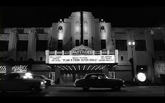
Here are the original Night of the Creeps posters

Domestic Theatrical Poster:

I like this one and would have been fine with it being replicated for the digital release, but it's my least favorite of the three original designs. This is also the only poster to feature both of the film's two tag lines.


International Theatrical Poster:


I prefer this simpler design because like the 50s-60s genre film that it pays tribute to, it doesn't really tell you too much about the film itself.

Video Release Poster:

This is the art I most associate with Creeps as I discovered the film on VHS which featured this as the cover. I still prefer it. The tag line clues you into the film's sense of humor, while the central image is memorable and intriguing for first timers.

When it came to the digital release, not only did they screw up once, but twice, since the Blu-Ray and DVD each have separate covers (technically it's three times since there was a voting process for fans to choose their preferred design, the third is actually the worst, but you know, whichever wins, we lose and what have you).

Here's the Blu-Ray Cover:

Besides suffering a bad case of the BIG HEAD cover syndrome of the late aughts, it also contains a pretty major spoiler on the left hand side, as well as an emphasis on the alien, who are only featured in the film's pre-credit prologue.

...and here's the DVD cover--
I guess this is the best of the three original options, the colors are a weird choice, but the film is a bit off kilter, so that's appropriate. However, my main issue is that it seems there was a debate whether to stick with the aforementioned big head route or to go for something more interesting, like the 50's couple in the bottom half, another reference to the opening prologue (did the cover designers just watch the first and last ten minutes of the film?), and decided instead of making a choice to go with both. Unfortunately, this is not a Reese's Peanut Butter cup situation, as the two tastes don't blend well and the owner of the DVD is stuck with a schizophrenic case.

Here is the original Monster Squad poster


For a generation who grew up with this film, this poster is iconic. This was the VHS cover and I cannot count the number of people I've seen sporting the "squad" portion of this image on t-shirts. Sure the tag line is unnecessary, but perhaps just the squad ready for action in front of the car would've made for a fan pleasing cover.

Instead we get this DVD cover:


Again, not awful, but it seems to be an attempt to confuse consumers into thinking that this was one of Harry Potter's side adventures. And while the Dracula resembles Duncan Regehr in costume, neither the Wolfman or Frankenstein's monster look anything like their Stan Winston created film incarnation.

But if mangling the DVD and Blu-Ray cover is what it takes for Dekker to finally get his work out there, I guess in the long run, it's a minor annoyance for a greater good. And I would gladly endure an awful movie poster if it means Dekker gets an opportunity to direct again.

Monday, October 27, 2008

When Bad DVD Covers Happen to Good Movies: The Legend of Hell House

Most haunted house movies tend to falter in their conclusion when attempting to coalesce the supernatural goings on with a logical explanation. The Legend of Hell House is not an exception to that rule. However, up until that point, it's an effective thriller that exceptionally utilizes atmosphere and features quality work from it's four primary actors whose characters see their more sinister and sexual tendencies manifested by the provokings of the Belasco Mansion spirits.

Adapted from author/screenwriter Richard Matheson's (the I Am Legend novel, several notable Twilight Zone episodes, Duel) novel "Hell House", director John Hough and cinematographer Alan Hume create tension by peculiar framing--the four characters are often placed expressively or unnaturally within the same frame so that you can clearly see them all; and items and/or people are often situated right in front of the frame--as well as lighting that emphasizes fog and heavy color filtering, and an editing style that often cuts away from a scene a beat too early to an establishing shot that informs us the exact date and time of the following scene.

As mentioned earlier, there are only four significant characters in the entire film (and only about seven speaking roles in total), so it's kind of a shame that if given the right amount of attention, the viewer can gauge a major spoiler from FOX's DVD cover. And is the blue tint supposed to hide that particular character's identity or evoke the fog shrouded cinematography? Either way it fails.

Better options:

I love (strike that, lurve) the above illustrated poster from the film's 1973 theatrical release that recalls a 1950's era EC comic cover but I do understand it may be too elusive or era specific to spark consumer interest. So instead, my recommendation is to go with the still below from early in the film when all four characters first enter the gates of Hell House. It not only displays the three main elements of the film: the house, the atmosphere and the characters, it also gives a sense of the unique compositions and style of the film. An added bonus, Edgar Wright paid homage to this specific shot in his faux Grindhouse trailer, Don't!

Tuesday, December 4, 2007

When Bad DVD Covers Happen To Good Movies (Sort of) #3

Although I mentioned it in another context in the postscript of my Maniac review, I failed to evoke Black Christmas when discussing other horror films that open with a shot of the killer’s subjective point of view. An especially glaring omission since not only does it predate the other films mentioned (yes, even Halloween) but because since the age of 16 when I randomly discovered it in the horror section at the Wherehouse (Where? The Wherehouse!) , I’ve become slightly obsessed with the film and count it amongst my favorite films of all time, regardless of genre.

With the holiday season in full bloom, this month will mark my annual viewing of Bob Clark’s 1973 masterpiece, and hopefully unlike a few years ago when I arrived to a sold out sign, I will be able to see it theatrically for the first time at the New Beverly on December 18th when it plays with 1984’s Silent Night, Deadly Night in a Christmas slasher double bill. Perhaps after that screening I will discuss in further detail my appreciation for the film itself, but now to the subject at hand: the overall sucky-assness of Critical Mass’s Collector’s Edition DVD cover, circa 2003. There are several different DVD releases of Black Christmas with several different covers, but I am focusing on this one because it’s the DVD most leaden with extras, and it happens to be the version I own.

Apparently employing the same graphic designers assigned to create the many radio talk show host billboards in Los Angeles, the Black Christmas DVD cover is a mess of composition, fonts gone crazy and a lame tagline. Let’s start with the composition, I have no issues with the background shot of the sorority house that serves as the setting for the majority of the film, but egads, that foreground picture is horrendous, having seen the movie numerous times it took me a close inspection before I realized that the person in close-up is not in fact a victim of the invasion of the body snatchers or a burn ward patient, but rather the film’s first victim, suffocated by a plastic bag. What would someone who hadn’t seen the movie think? As for the mixed fonts, was that the result of a late night compromise between someone who wanted to go with an X-Files inspired glowing uncapitalized typewriter feel with someone who is a big fan of the shattered glass effect? In the future, someone has to just give up their pride and say, you know what bro, I’ll get the next cover. Lastly the tagline “’Twas the night before Christmas and all through the house, a creature was stirring…”, while not as lame in comparison to the other atrocities, it pales next to the original tagline which is still one of the all time greats: “If this movie doesn’t make your skin crawl…IT’S ON TOO TIGHT!”

BUT…and here’s where Critical Mass redeems itself, when you tear through the shrink-wrap, you have the option of reversing the cover where you can display the classic hand drawn poster containing a clear view of the suffocated victim in a Christmas wreath, with the original awesome tagline and the title in one continuous font throughout both words. Black Christmas was released under several different titles including Silent Night, Evil Night and the less festive Stranger in the House, but each release featured this classic design. While I have to slag Critical Mass for not making this the cover buyers will see displayed at their local DVD retailer, I do give them huzzahs for including it at all! This is the cover that prompted my initial rental and began my 15 plus year love affair with the film. If this was the cover when I was 16, I probably would’ve walked out with the latest Children of the Corn sequel instead.


Special Note: This is the third or fourth time I’ve mentioned Black Christmas on this blog, and the first time I didn’t reference last year’s crappy remake. Yay for me! Oh, whoops…

Thursday, May 31, 2007

When Bad DVD Covers Happen to Good Movies # 2

Film: Bad Education (2004, Pedro Almodovar)

Offending Cover:


The only explanation I can deduce as to the origin of this horrendous cover is either: A.) It was the result of a late into the night compromise when the graphic design department couldn't decide whether to play up Gael Garcia Bernal's handsome looks or his dramatic transformation as a cross dresser in the film, when suddenly, angered and wanting to return home to his wife, children and drinking problem one designer ripped both covers in half and tossed them on his desk in frustration, leading to the other putting them next to the each other and uttering a sentence that started with, "Hey Carl, I have a crazy idea...", resulting in the above. Or B.) A ultra meta statement on the inner turmoil and abused past of the film's character by making the DVD renter or buyer experience that exact inner turmoil and abuse when looking at the cover. Cleverly played, Sony graphic designer!

Better Option:

Perhaps not Pedro Almodovar's most striking poster, but its nicely understated while simultaneously haunting.

Note: Sony has recently released a "Viva Almodovar!" box set featuring amongst other works, Bad Education, I have not purchased it, so I cannot personally confirm, but judging from the box artwork, they may have decided to go with the latter, better option. Good work, Sony, now just destroy all the prior covers and we'll call it a mulligan.

Thursday, March 1, 2007

When Bad DVD Covers Happen to Good Movies

Film: 24 Hour Party People (2002, Michael Winterbottom)

Offender: MGM

Exhibit A:


Film: 24 Hour Party People (2002)

Through shadowy means, I have been able to obtain the transcript from the art director's meeting at the MGM DVD division on the day of the decision to go with the cover:

"So what's on the schedule"

"The film is 24 Hour Party People"

"Okay, never heard of it. But the stock solution for smaller market films is a big picture of the star of the movie on the cover. Who's in it?"

"Steve Coogan"

"Steve Coogan...Coogan...Okay, I got it, a big picture of him with his "Crocodile" Dundee clothing on, and maybe the tagline could be "You call that a party? Now, this, this is a party"

"Uh, actually that's Paul Hogan you're thinking of"

"Oh? Then who is Steve Coogan?"

"A British comedian"

"Okay, ax that plan, Americans don't like movies featuring people speaking a foreign language, so let's hide the overall foreigness factor"

"British people speak...nevermind"

"So what's this movie about?"

"The late 70s-early 80s post-punk and dance music scene and the man who created Factory Records and introduced the world to bands like Joy Division, New Order and the Happy Mondays"

"I've never heard of any of those bands, but I got a vision...this movie is about outsider non conformist, in your face type music, like Fall Out Boy right?"

"Uh, I guess"

"What is more in your face than a giant picture of a guy's tongue sticking out right at you?"

"I..."

"The answer is nothing is more in your face than a giant picture of a guy's tongue sticking out right at you...except for...a guy with a pierce tongue sticking his tongue out right at you! That's it, make it happen. I want people afraid that this DVD cover is going to eat them, that's how punk this movie is. Now, I have a lunch to get to."

"You sure about this one?"

"Do I look sure...of course, I am sure...oh and another thing, let's have the title on the dude's tongue and I don't know...a random hot babe that is not in the movie on the other side"

Better Option:


This poster gives more of the sense of the film and actually looks like it could be the record cover for a band that was on Factory Records, well, actually it looks a lot like a Wire album, and they were not on Factory, but they are from the time frame and sensibility of the bands featured in 24 Hour Party People and not the dated 90s grunge signifier that is a pierced tongue.
Related Posts with Thumbnails